What Colors Should Your Picture Wall Have?
Choosing colors is one of the most important parts of interior design, and a picture wall is no exception. The right colors can completely transform a space, whether you want a calm and balanced home or a bold and playful expression. In this guide, we go through basic color theory, practical tips, and why you sometimes should ignore the rules and simply choose what you love.
Use Color Theory for Harmony
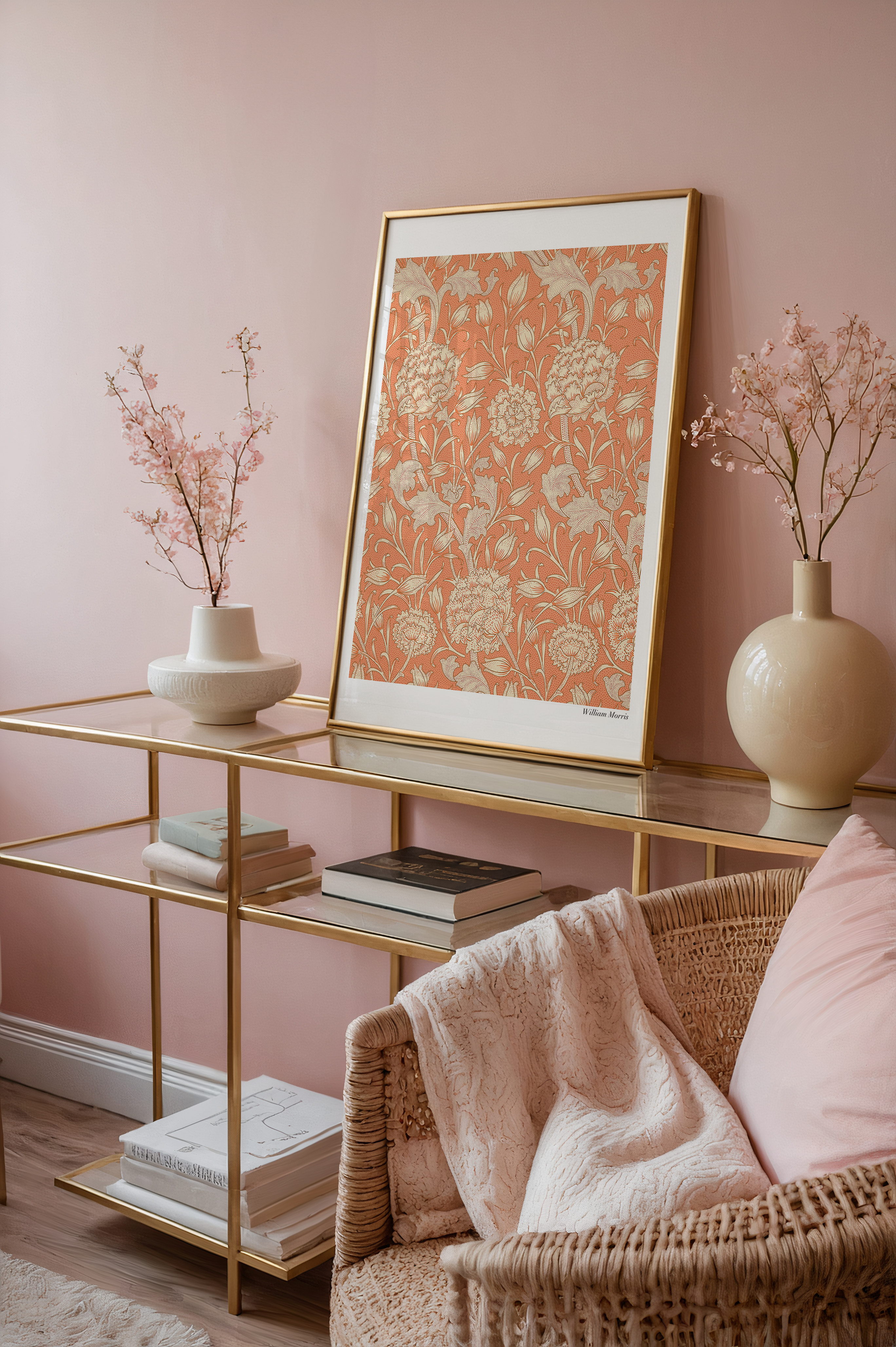
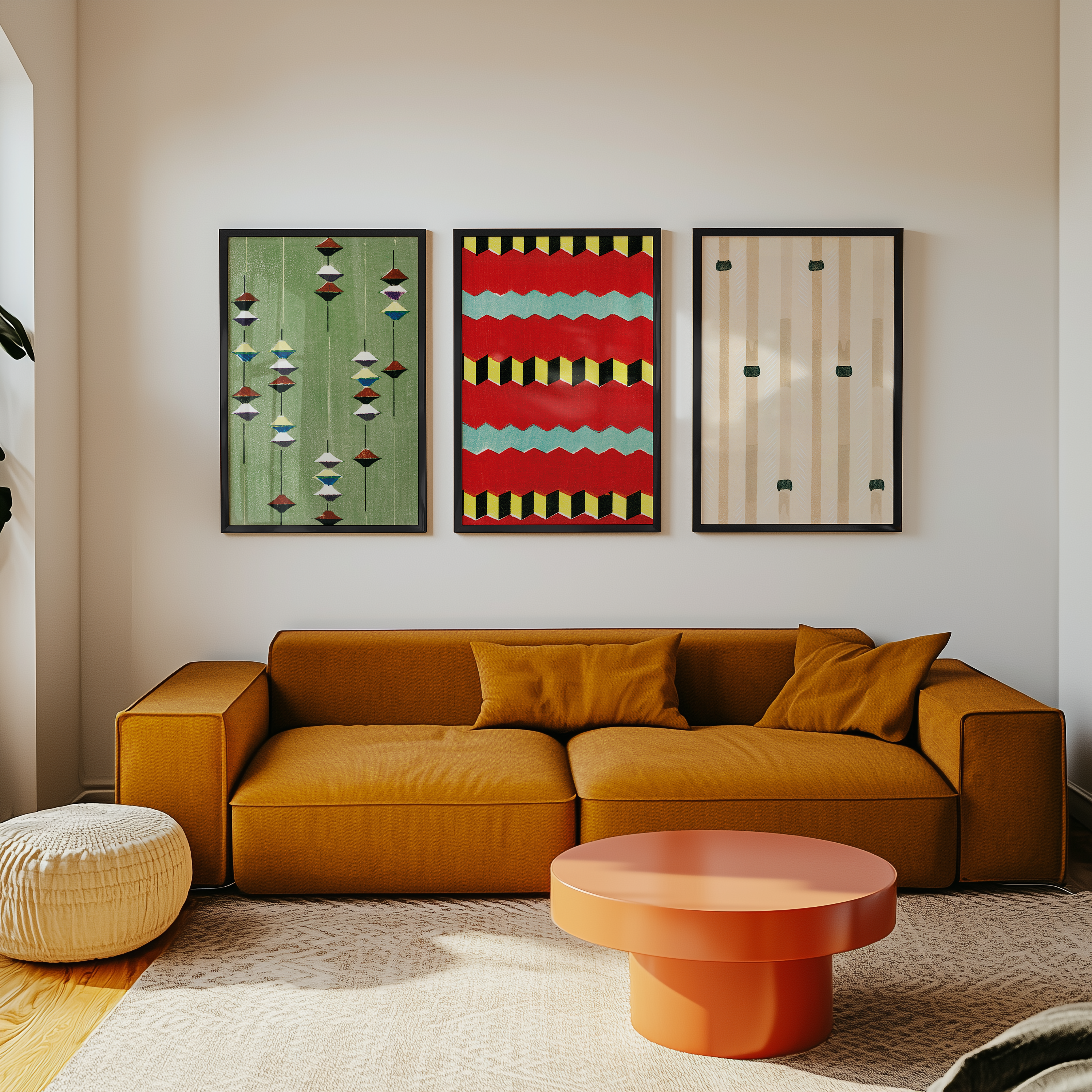
A good starting point is to look at complementary colors – tones that sit opposite each other on the color wheel, such as blue and orange or green and red. These combinations create energy and contrast, perfect if you want your gallery wall to become the focal point of a room. If you prefer a softer impression, go for analogous colors like beige, brown, and cream that sit close to each other and naturally create a calm atmosphere.
Posters are an easy way to test color theory without committing to big renovations. Choose artworks in shades that highlight or balance your wall color, and you’ll quickly notice how the whole room feels more thought-out.

Match or Contrast with Your Walls
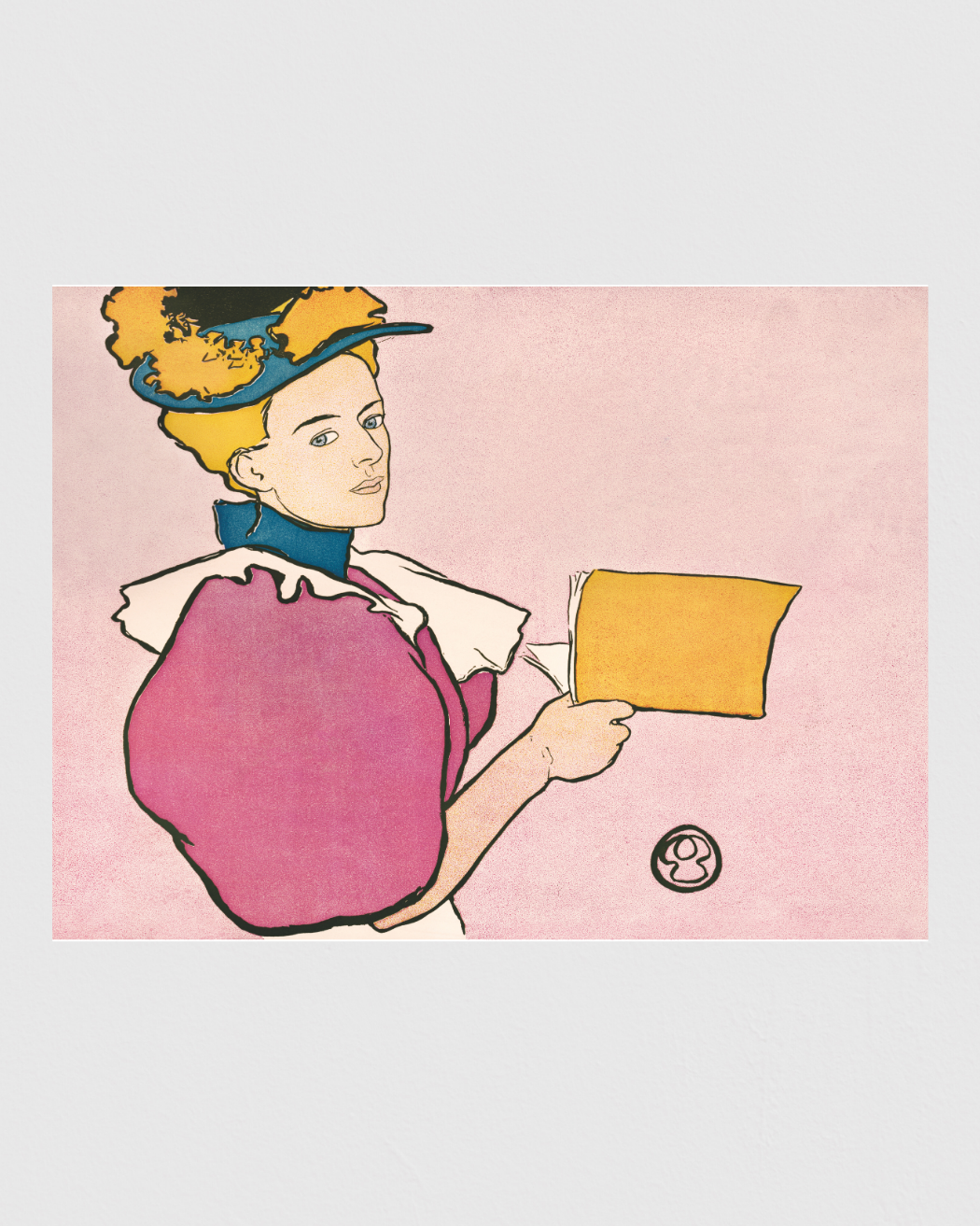
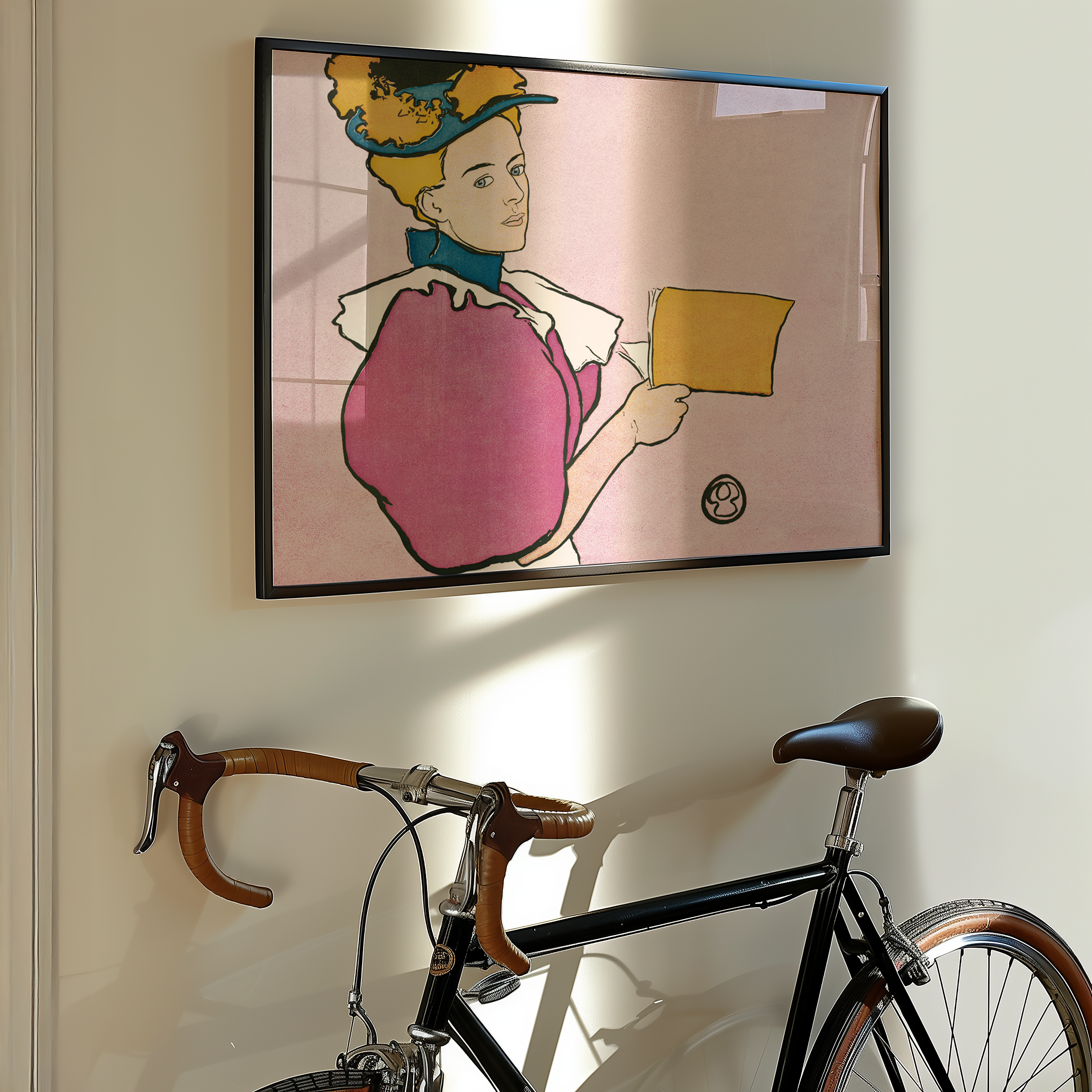
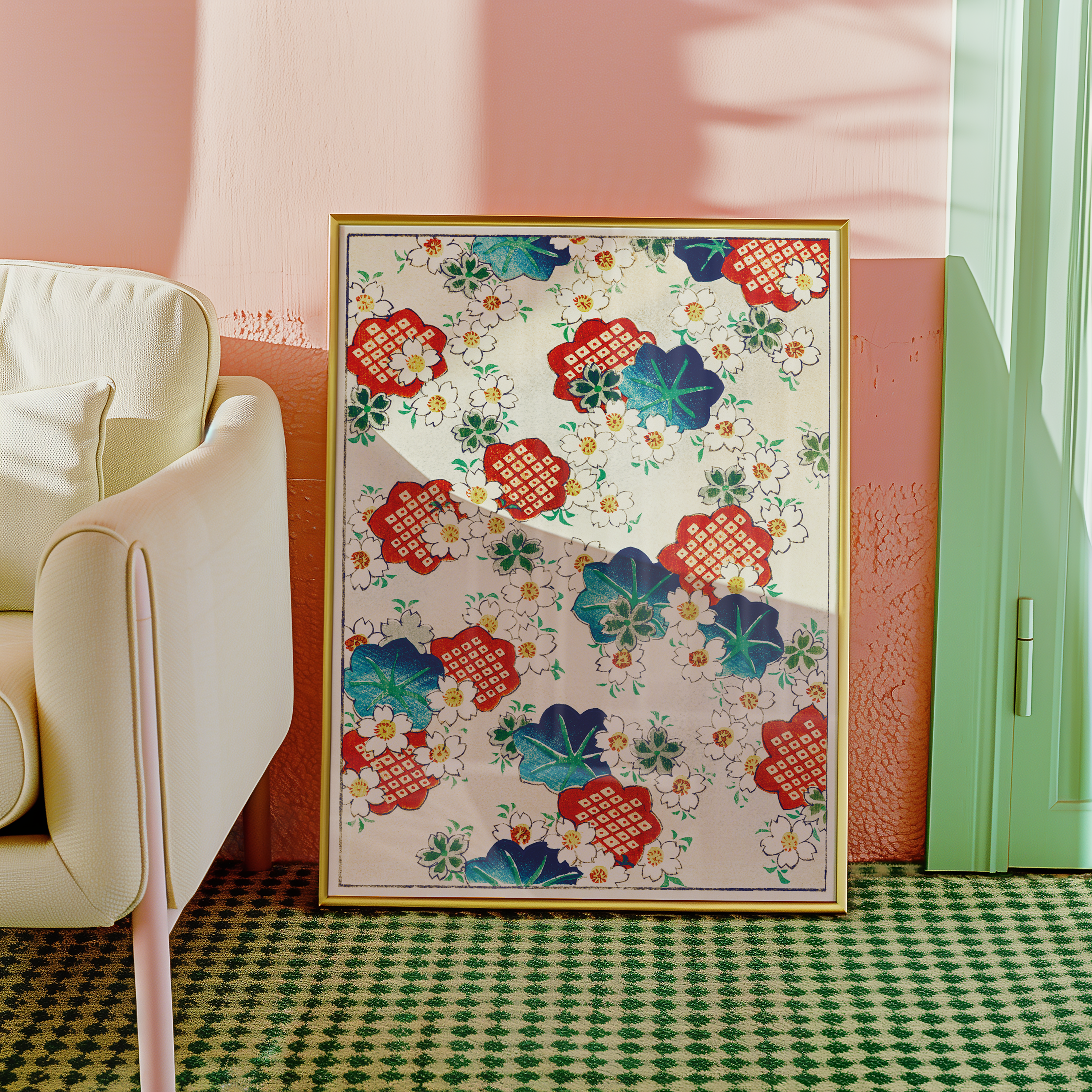
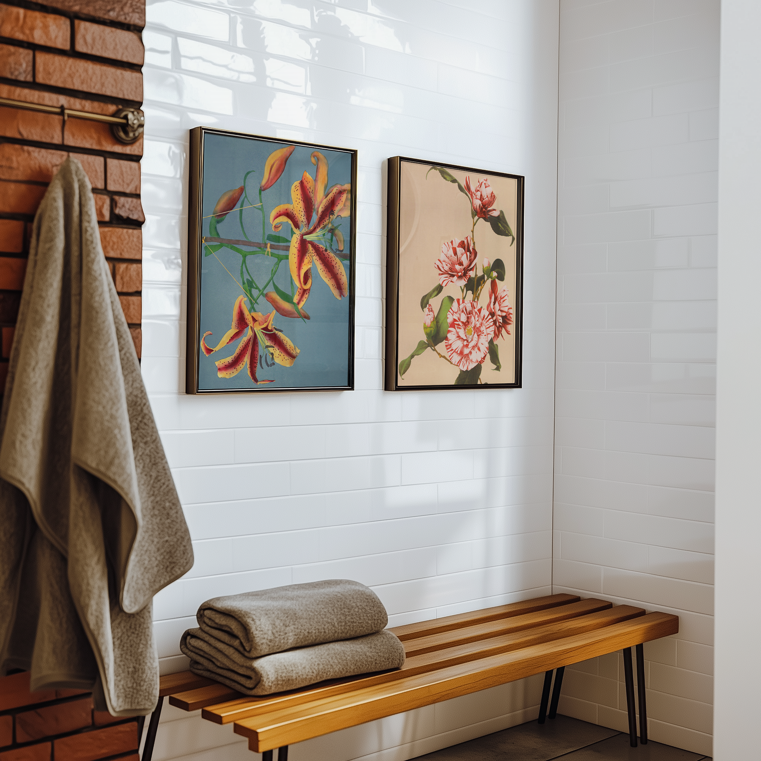
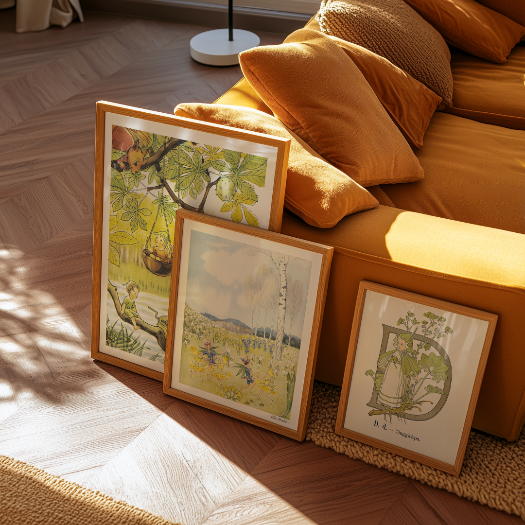
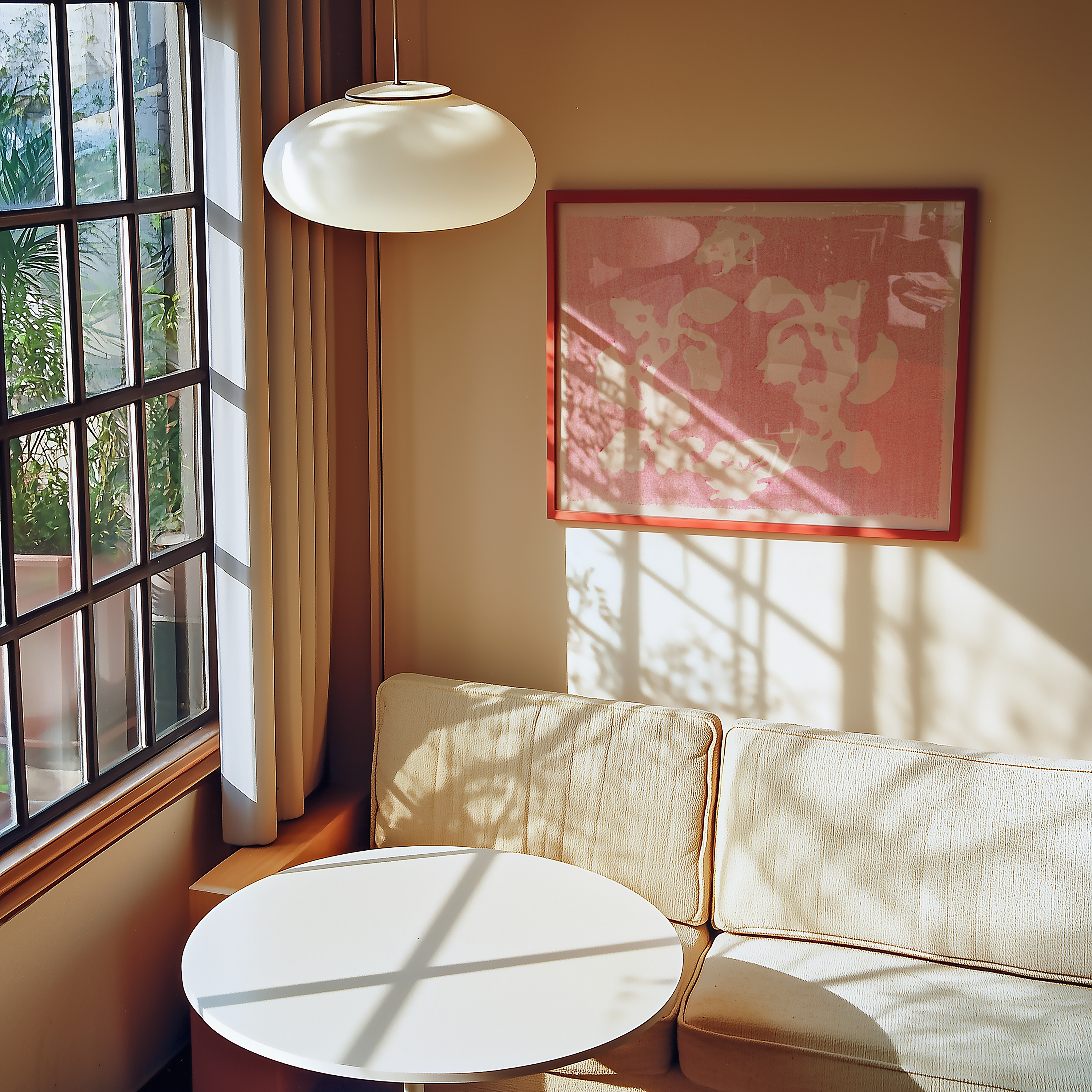
For many, the simplest way is to match posters with existing wall colors. A beige wall can highlight warm earth tones, while a gray wall becomes more vibrant with colorful motifs in green, yellow, or red. But there is no rule saying everything must match – sometimes it’s the unexpected contrasts that make your interior design truly personal. A black-and-white photograph on a bright wall or a bold red poster in a calm, neutral living room can be just as striking as a carefully coordinated palette.
Let Colors Reflect the Room’s Function
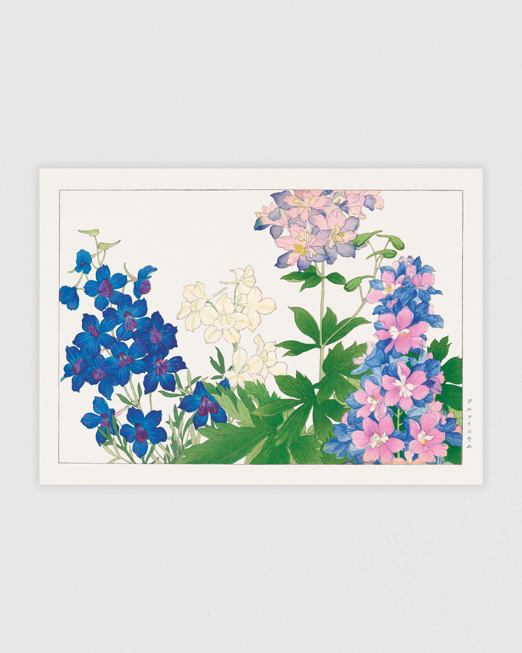
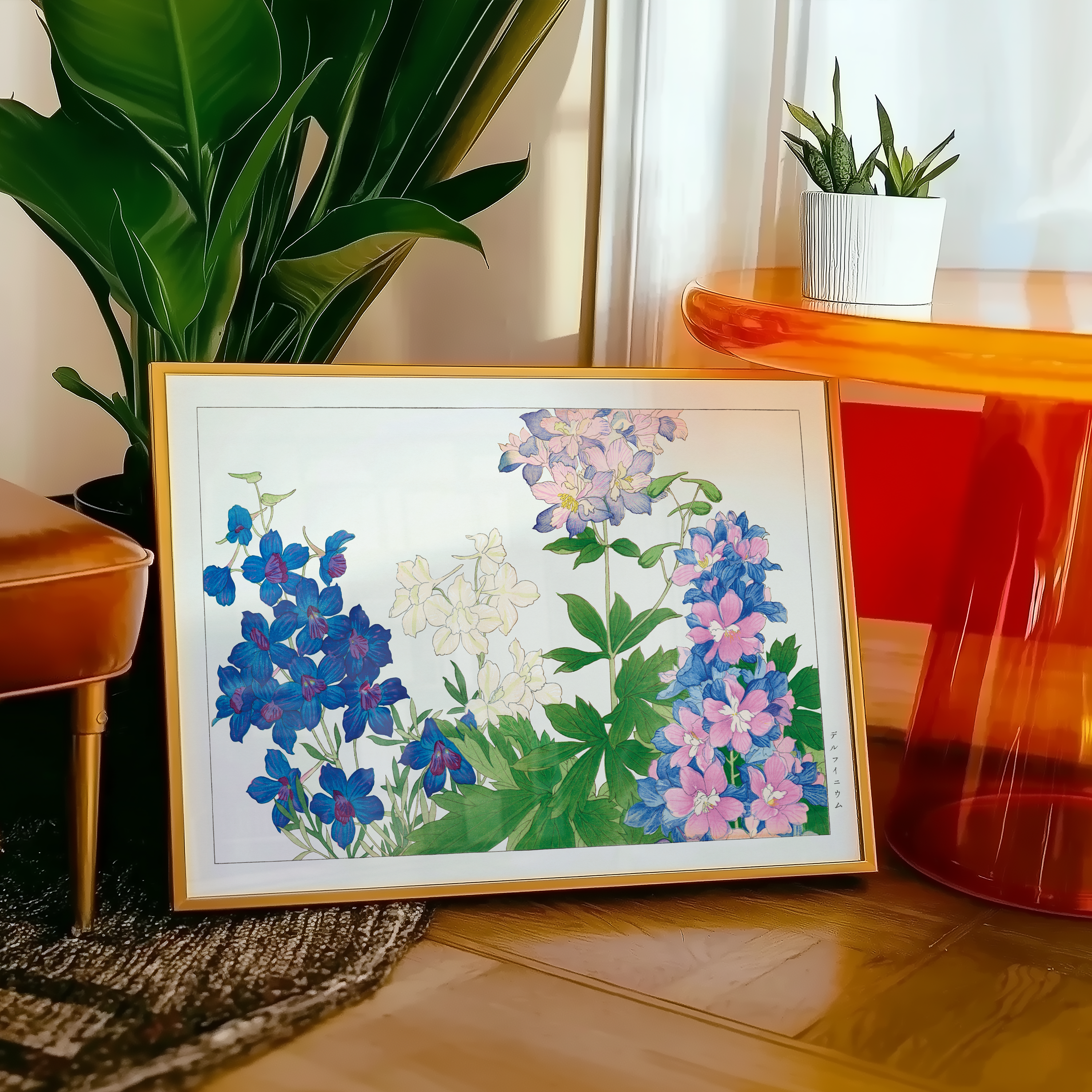
Colors affect us more than we think. In the bedroom, soft tones like pink, beige, and muted green create calm and harmony. In the living room, you can add warmth and energy with posters in orange, red, or yellow. In the kitchen or hallway, fresh colors like green or blue work well to give a lively impression.
Break the Rules – Decorate with What You Love
Even though color theory provides great guidelines, your home doesn’t need to follow strict rules. If you love bold contrasts, let a picture wall in blue and red dominate your living room. If pastel colors make you happy, let them fill the walls regardless of season or trend. Posters are meant to express your personality, so don’t be afraid to mix styles and colors until the result feels right for you.

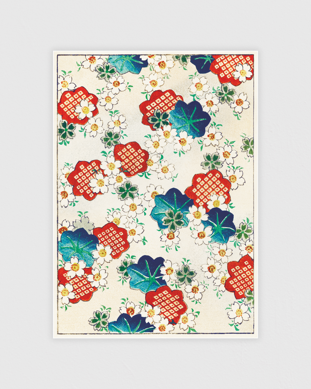
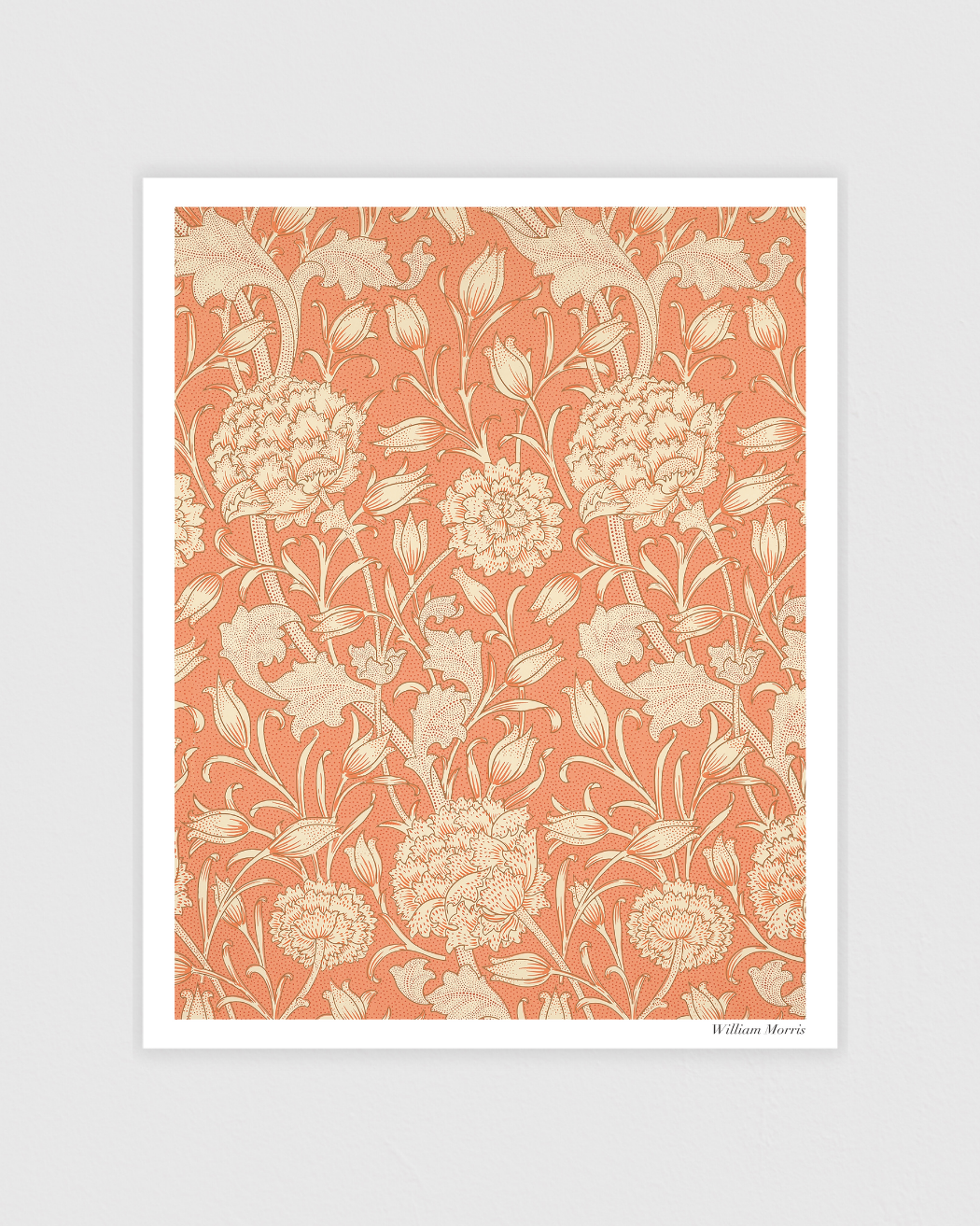
From Subtle to Bold – Endless Possibilities
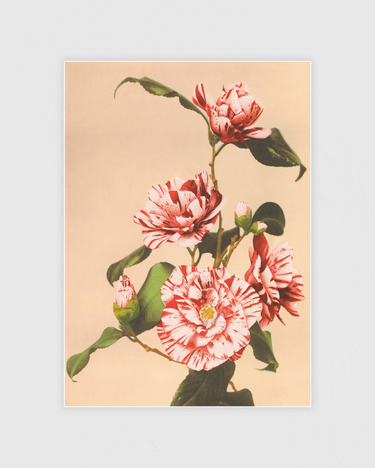
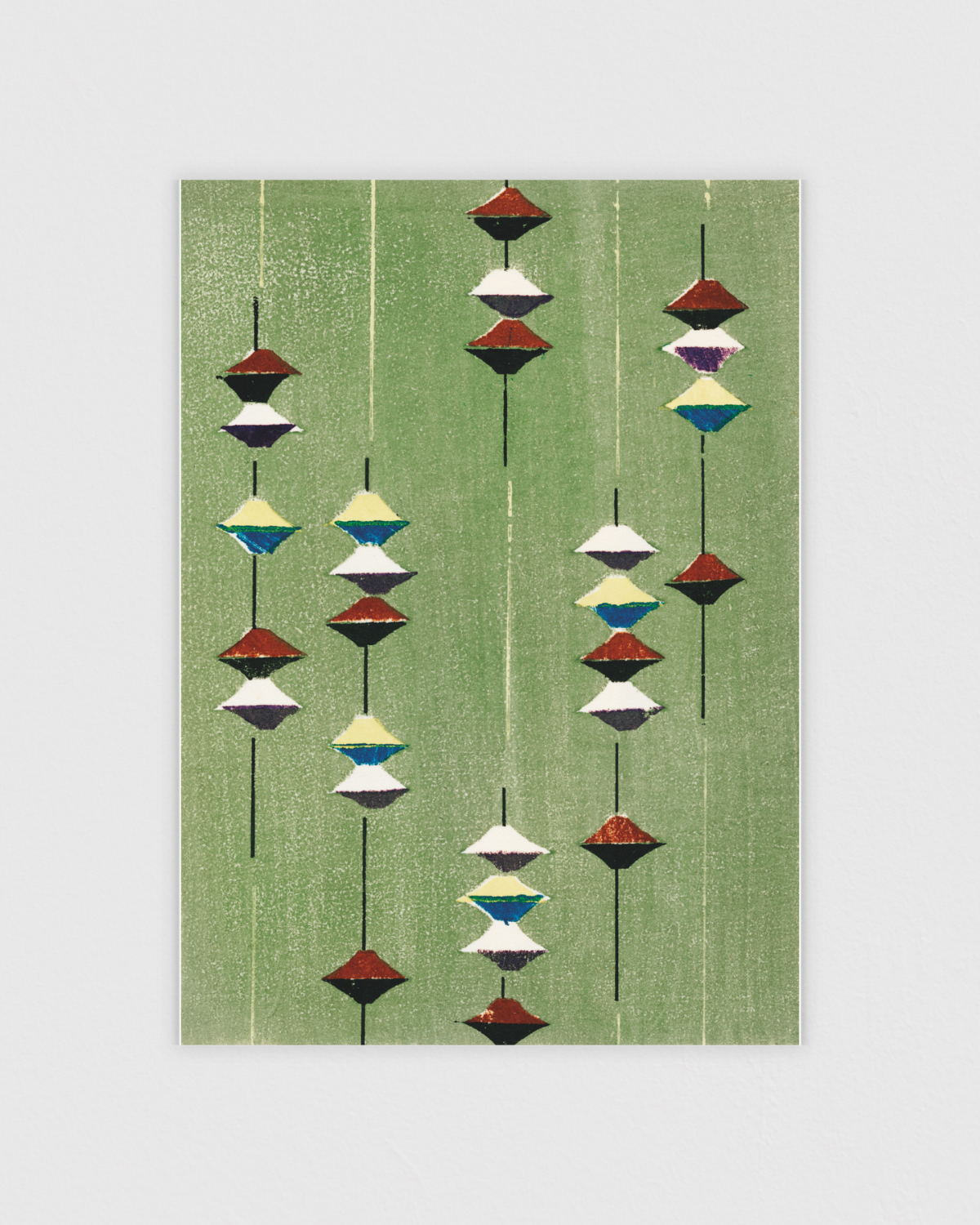
At Posterton, you’ll find posters in every style and color palette – from light Scandinavian tones and soft Japanese illustrations to bold advertising art and colorful botanical prints. Whether you’re moving into a new apartment, renovating, or just refreshing your living room, posters make it easy to experiment with colors and find a style that feels personal.