How to
Which colors should your poster wall have?
Colors are essential when it comes to interior design, but creating a common thread in terms of color is not always the easiest thing to do. Here we guide you on how to create a harmonious and balanced impression in your home by starting from a color palette. We recommend matching your posters with wall colors and decor to create a harmonious feeling in your home.
Before choosing colors, it can be good to think about which color tone dominates in your home. Take a look and see if you can already see a coherent theme, for example, what colors does your favorite flowers have? What tones does your pillows, blanket etc have on the sofa? Another option is to be inspired by our posters and decorate your home accordingly. Sometimes it can be easier to start with two colors that you really like. Carefully choose posters that match your color choices, but most importantly, choose motifs that you actually like. The decor should reflect your personality!
Colors affect us more than you think and it can therefore be good to think about what feeling you are striving for in each room. Warm colors such as red and yellow feel more intense, lively while the cold colors blue and green contribute to a more calm and harmonious atmosphere. Be inspired by the spring trend palettes that focus on light and warmth. In the picture walls below, you can see, for example, how the colors from the paintings are repeated in the interior. A tip is to look at our page for picture walls that give suggestions for nice picture combinations developed by our stylists. Now that we spend so much time at home, it is more important than ever to create a pleasant and harmonious environment.

warm and harmonic
Soft natural colors create light and harmony in your home. Capture it with bright interior details for a uniform effect. A beige wall color can accentuate the color images and tie the interior together in a harmonious way.
Combine the pink motifs with pillows and textiles in natural colors for a peaceful impression. It could not be cozier!
natural and energetic
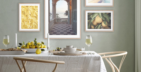
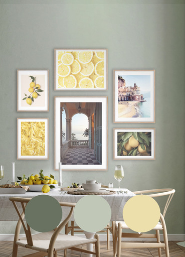
Green is a grateful color as it can be combined with many colors. In this picture wall, we have chosen to highlight yellow tones, which is one of spring's big trend colors.

BRIGHT AND CALMING
Soft, natural colors will make your home look brighter and more harmonious. Add the finishing touch by choosing bright interior details to create a unified effect. You can take a cue from the popular Japandi or Scandi style.
A beige wall color can accentuate the picture colors and unite the interior in a harmonious way.
Create a harmonious impression in your home and get inspired by the colors of summer!
See all posters